UX/UI Designer specializing in no-code and design systems, with a data-driven UX approach. I partner with startups and corporate teams to build scalable design systems in Figma and user-metrics-driven Webflow implementations that maximize conversions.
Improving product development efficiency by 59% with a scalable design system.
Deliverables
Design System
UI Design
UX Design
Team
Design System Owner
UX/UI Designer
UX/UI Designer
UX/UI Designer
Developer
Developer
Developer
Tools
Figma
Atomic Design
Stark
Figma Tokens
No items found.
Opportunity
When I took ownership of our Design System in Figma, I discovered that despite its potential, it was fragmented and underused. Components were crowded onto one page, without a clear structure or semantic guidance explaining when or how to use them. Developers saw it more as a visual moodboard than a source of truth for clean code; the primary button, for example, reached only 60% adoption in new projects. Worse, nearly every screen failed to meet WCAG AA contrast, putting the platform’s accessibility at risk and delaying development cycles whenever someone reinvented an existing pattern.
My Role and Team
Over three intensive months, from January through March 2025, I led this transformation as Design System Owner alongside three UX/UI designers and three developers, who became not only implementers but partners in this evolution.
The Story Behind the Change
As we explored the Figma file, we realized that every component told a different story. There was no shared language: some styles used dull grays, others used greens that were too bright for alerts, and type sizes shifted without a defined scale. I decided that our color palette and typography needed to speak the same language: clear, predictable, and accessible.
Previous color system.
First, in FigJam, we mapped primitive tokens: “GREY/20” was the lightest gray, “GREEN/60” was our success color. We then assigned each one a role through semantic tokens, for example, background-button-primary or text-secondary — so any developer working in code could immediately understand the purpose of every variable.
Example of semantic token construction in Figma variants.
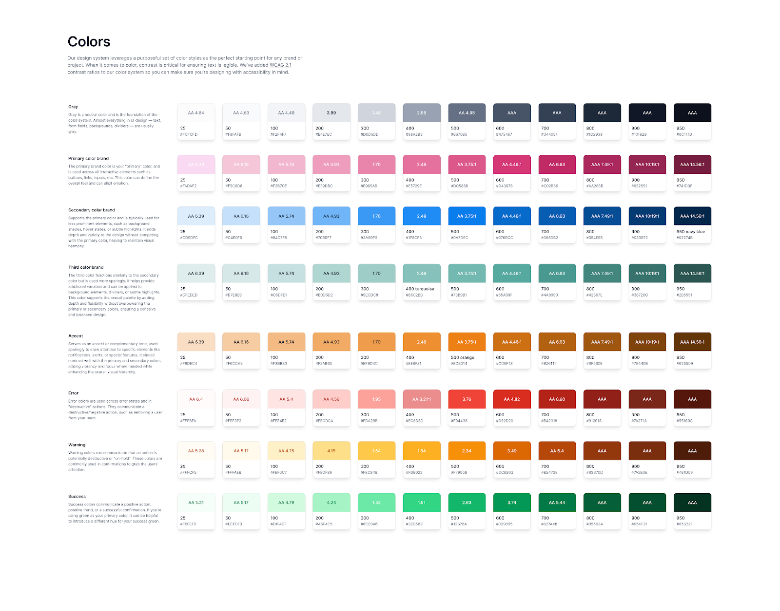
We also designed a new color scale that ensured minimum WCAG AA contrast, applying semantic variables at every luminosity level to cover all use cases.
New color system that meets the WCAG AA minimum contrast requirement
In parallel, we established a typographic scale based on a mathematical progression (ratio 1.309 based on 16 px), defining styles from heading-xl through body-sm, with line-height and kerning carefully considered to restore harmony across every screen.
New typographic scale.
New typography variables.
Button Analysis and Implementation
First, we analyzed the accessibility of the existing button, measuring its contrast ratio across every state and finding it did not meet the WCAG AA minimum.
Previous primary button, which did not meet the AA minimum
Based on this assessment, we implemented the new definition of primary-button-background as the primary background, ensuring the color met minimum AA contrast standards in every application.
New button component in the design system, meeting the AA minimum.
Next, we applied the new token definitions for both fill and stroke across the different button types: primary, secondary and tertiary. For each type, we documented specific parameters across four component states: default, hover, focus and disabled, ensuring a consistent, accessible experience that was easy to implement in development.
Previous button component within the design system.
New button component within the design system.
This button refactor is only one example of our work. In total, we addressed approximately 20 additional components, including information cards, input fields, dropdown menus, and switches. We applied the same accessibility analysis and token definitions for fill and stroke, and standardized states default, hover, focus and disabled to ensure consistency, accessibility, and ease of implementation throughout the system.
The Transformation in Action
Instead of delivering a package of changes and disappearing, I held one to one sessions with every developer. I shared the reasoning behind each token and gave us time to explore Dev Mode, answer questions, and listen to their suggestions. These conversations led to small improvements, such as adjusting the opacity of a gray border and adding a variable for an alert state. Every contribution was incorporated, keeping the team centered on a shared mission.
To formalize the system’s growth, we appointed a single owner from the design team to review and prioritize requests for new components or changes, evaluating impact according to the number of screens using them and the complexity of implementation. The system evolved from a chaotic living entity into one governed by clear criteria.
Impact and Learnings
One month after launching the new Design System, the lead developer told me: “Implementation time for a new module decreased by 20%. We no longer have to guess which color belongs to an error state or rebuild buttons manually.” Using the available data, we calculated savings of 190 hours per year, a 59% increase in efficiency, with an estimated financial impact of $56,000 USD. But the real value was in the team dynamic: designers and developers spoke the same language and resolved questions in Slack using token references while celebrating every newly adopted component. I learned that a strong Design System is not imposed. It is created collaboratively, strengthened by contributions, and sustained through a compelling narrative.




%2011.18.20%E2%80%AFp.m..png)
